Back to projects

Guest App Check-in

Life House
UI UX Design
2022
The mobile app feature allows guests to check in using their phone, and enhance their experience by providing them with a faster and seamless arrival process.
[Discover]

Context & Problem statment

As a product designer at the core of Life House's product team, I was involved in exploring ways to enhance the overall guest experience.

Before this project, the mobile app was exciting as watching paint dry and users had no clue how useful it could be throughout their stay experience. We needed to spice up the app to get the users excited about it, starting by making sure guests feel like they're floating on clouds from the moment they arrive. So, how make the mobile app a must-have for guests, and create a seamless arrival experience?
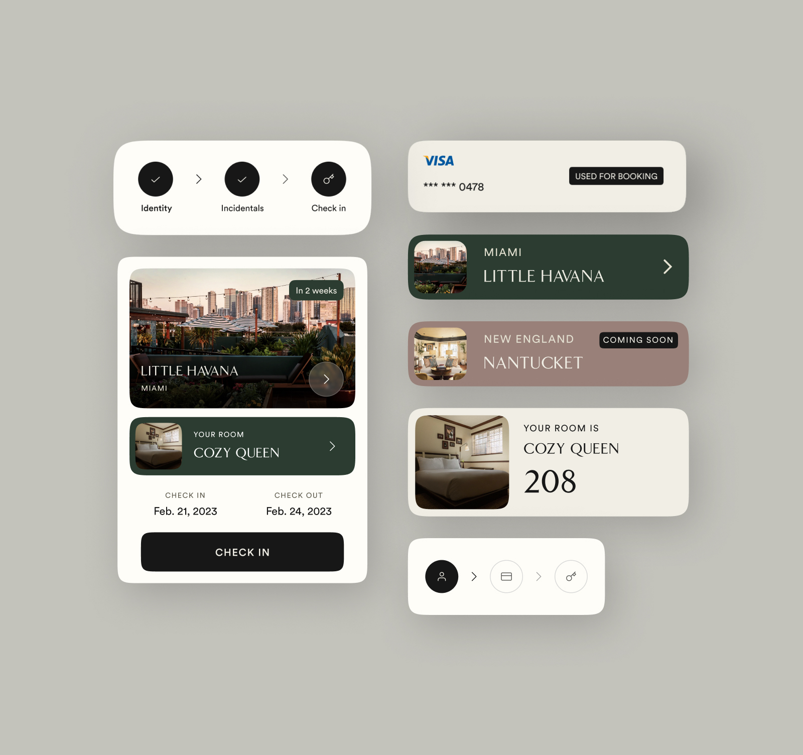
KICK OFF THE STAY EXPERIENCE
Immersing the guests in their upcoming stay
The trips page is a crucial screen for users to start their stay, so we aimed to keep it uncluttered and engaging by providing easy access to hotel details and room information.
CHECK IN CARD
This component has different states depending on how close the stay is to start.

User flow

We endeavoured to eliminate any unnecessary elements and ensure a clear and direct check-in flow for the user.

Design approach

We wanted to maintain the editorial appearance of the UI while ensuring a functional and seamless flow, and introducing more emotional elements to enhance the user experience. I intended to deliver a straightforward and effortless user journey, and to provide clear visual indications of the user's progress.

Outcome

After implementing the check in feature, we observed a rise in the number of downloads from the app store. Currently, about 30% of guests use the app to check-in, and we have received encouraging feedback. Additionally, we have identified a user persona that expresses a keen interest in engaging more with the app.

Get in touch

Email

Malt

Phone

Instagram

Dribbble

Linkedin